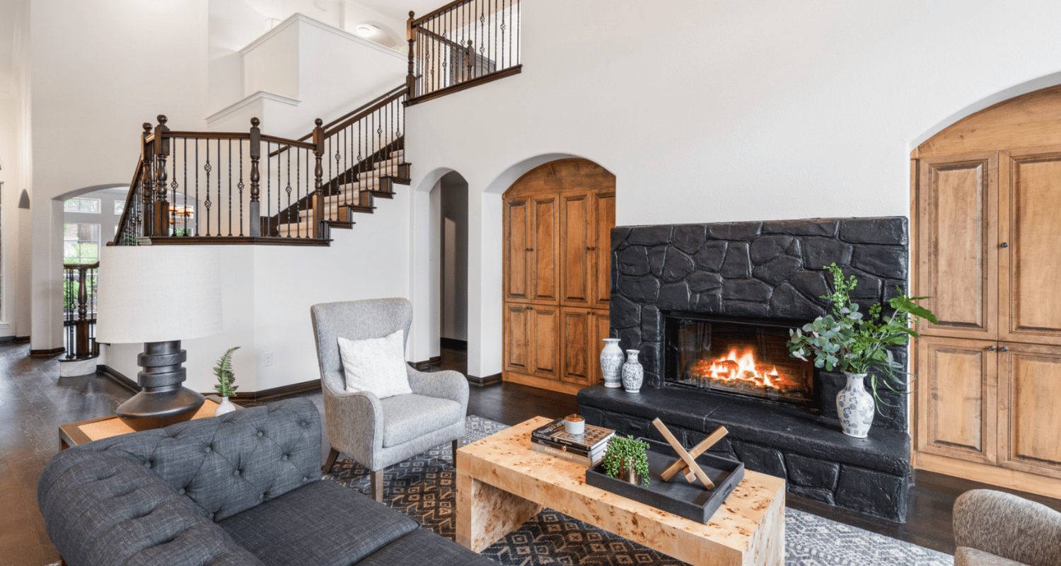
The art of styling a home for sale is vastly different from styling a home for personal living. Your design must appeal to the tastes of hundreds of prospective buyers, photograph like a show home, and be totally absent of personal photographs. Sellers who get this challenge right win the ultimate prize: a faster, higher priced sale. In HomeLight’s recent nationwide Top Agent Insights Report, agents said a staged home can sell for up to 13% more than an unstaged home. Using a median home price of $400,000, top agents estimate that — if well staged — the home could sell for as much as $52,000 more, depending on its location and market conditions We spoke with HomeLight Elite Agent Sarah Leonard, an expert who sells homes 52% quicker than the average agent in Schaumburg, Illinois, and two professional stagers at the top of their game to create a list of the best tips and tricks to style every surface. Here are the styling tips you need to know for selling your home: Before you hit up HomeGoods, kick off the staging process by decluttering, depersonalizing, and deep cleaning your whole house. Faced with a far cleaner canvas to style, commit to these four guiding principles: The style and accessories you choose to style your home with should reflect your target buyer, not your personal tastes. Lance recommends leaning into your agent for advice on what styles will resonate with your home’s buyer pool: “You want people to feel your home is relatable as they’re coming into your house. It’s not necessarily price point, but who’s our target demographic. So if it’s a ranch home, a single story, maybe it’s someone downsizing . . . It’s just knowing the demographic of who your target buyer is and playing off of that.” Show off your home’s architecture with complementary furniture and decor pieces — just don’t go overboard. Justin M. Riordan, founder of Spade & Archer Design Agency who stages homes of all architectural styles in Los Angeles, Portland, and Seattle advises: “If your house is a mid-century modern, you’re not going to design the entire thing with only mid-century modern furniture because nobody lives like this. You’re creating a museum if you do that. And so, you want to have an eclectic mix of furniture with a few nods that leans slightly towards mid-century modern.” Fakery distracts buyers from your home’s real features, fostering skepticism in their psyche. Riordan urges sellers to avoid fake props, artificial food, and flowers at all costs. No substituting real mattresses with blowup ones no matter how seemingly stealth they may appear. No stale biscotti and empty mug in the living room. And please, absolutely no champagne glasses by the bathtub. Draw your buyers’ eyes up with these wall styling tips to enhance the appearance of room height. “We always tell people to leave everything off of the walls. In person, decor looks very nice and spruces up a place. However, online which is what everyone uses to start their search, it can really make the room look smaller,” shares Knapp. The less wall decor, the less there is to distract buyers from your home’s assets such as the high ceilings, fireplace, and custom moldings. If you have the budget, add light, neutral curtains to the living room, dining room, and primary bedroom. To elongate the room, hang floor length curtains from the curtain rod placed high on the wall, closer to the ceiling than the top of the window frame. Color wise, Killy Scheer, principal interior designer and founder of Scheer & Co., recommends sticking to white: “Lighter tends to sell better. People feel like it opens the room up and allows more light in.” Stage shelves and built-ins like a pro with these fool-proof tricks: Your personal library clutters your bookcases and open shelving units. Slim down your collection by taking out all paperbacks and removing dust jackets from your hardbacks. Group the remaining books by color, then organize each shelf by height (tallest to shortest or tallest in the middle to shortest on the outsides). “If we have a shelving unit with say 15 shelves on it, instead of having 350 different, little, tiny blocks of color, we’ll end up with 15 blocks of color in the photograph,” shares Riordan. “It would drive any librarian crazy to know that we’re organizing books by colors, but that’s really our big push to calm those bookshelves down visually.” For a simple, harmonious display, choose one type of decor item to repeat across every shelf. Riordan shares that Spade and Archer’s signature bookshelf display includes a set of unique typewriters or cameras. A repetitive design adds just enough interest in-person and looks amazing in listing photos. You can get the look by purchasing a selection of different shaped vases of the same color from World Market, IKEA, or second-hand shops. Scale wise, decorate your shelving units with objects that fill two-thirds of the space. This goldilocks proportion creates a balanced design that’s not too full or too empty. Add life to empty tables with visually pleasing decor that photographs beautifully. When styling your home for selling, books are your friend. Stack a short pile of hardback books or coffee table books neatly on surfaces like your coffee table, entry table, nightstands, and side tables. Then, polish the look with a book topper as Riordan describes, “Say we’re styling the coffee table, we might have a stack of books and it will have a book topper which is a small accessory, like a carving of a lion or a gold spray painted dinosaur. It’s something that sits on top of the books and sort of crowns it.” Curios like a magnifying glass, an animal statuette, or an abstract object make for perfect book toppers. When you need larger objects for prominent display areas such as the entry table or fireplace surround, employ a “trifecta” of three similar objects in the same color shade range at varying heights. A trifecta helps fill empty spaces, without stealing buyers’ attention away from the house. Customize your own set or purchase a pre-arranged group like this Aurora Rainbow 3 Piece Table Vase Set from Wayfair or this Tasia Wood 3-piece ball set from Joss & Main. Instead of setting the dining room table for a special meal, style the table as if you’re still setting it. Leave a stack of plates and a grouping of wine glasses in a cluster. This helps fill the table, without creating an overly formal scene. For the centerpiece, choose taller decor items to draw the eye up such as a trio of candle sticks or a decorative vase. One surprising styling tip from Riordan: Incorporate toys in your staging to entertain buyers’ little ones during the showing. “While the parents are having this great time spending this 10, 15, 20 minutes inside the house looking around, the kids are bored out of their gourds and they are whining and crying and pulling on their parents’ sleeves. And the parents cannot really give the emotional energy to the house that they need.” Here’s a few ways to stage toys to keep the whole family happy: Create a cheery atmosphere for buyers to relax into with warm, even lighting in every room. “When you swap out key light fixtures for more contemporary styles, it makes a huge difference. It brings the house up to today’s expectations and style standards,” shares Scheer, recommending that sellers replace hanging light fixtures and wall sconces for an updated look. Unless your home belongs to a higher price point, you don’t need to splurge on these fixtures to make an impact. Even affordable lights from retailers like Wayfair and AllModern will present better than your decades old brass (which by the way, is not the same as today’s trendy brass which is softer, duller, and warmer than the ‘80s iteration). Pro tip: Remove side tables next to sofas and armchairs and substitute in a floor lamp. Floor lamps take up less visual space, plus add light to the room for a more spacious appearance. “Realtors love to put lights on when they’re doing showings, they turn every single light on. So when they’re not matching, then you really see it,” warns Scheer. Swap out mismatched light bulbs so all the lights in the room match in color tone. For most homes, softer, warm toned light bulbs look best. However, cooler toned lightbulbs may suit a home with modern styling or with a cooler interior color palette of blues and grays. In addition to staging the main common areas, 75% of agents recommend that sellers stage the primary bedroom suite to best showcase the room where buyers will bookend each day. “We’re helping sell a lifestyle. Rooms don’t look magazine ready in real life, but we try to present that look when we’re completing a staging project,” explains Scheer. “Is this a bedroom you want to curl up and read a book in whether it’s on the bed or in the chairs?” If realistic for your situation, pare down your clothes for the listing period so you can remove bulky furniture pieces like wardrobes and storage units from the bedroom. In their place, stage a reading area with two accent chairs joined by a small round end table, or an armchair with a matching ottoman and floor lamp. Riordan recommends staging one masculine and one feminine nightstand, sharing that this helps buyers begin to imagine their side of the bed. Start with matching lamps on both sides, then accessorize one side with lighter, more delicate accessories and the other with darker, heavier objects. Following the latest design trends can offer some styling tips to inspire you. According to interior design leader Studio McGee, here are eight 2025 design trends to watch: Before jumping into any new design trend, talk to your agent about what buyers are looking for in your market, or with your type of home. A top agent will also have connections with professional home stagers and contractors who can make your home stand out and attract buyers. While each of these styling tips creates a subtle difference, together they add up to make a big impression on buyers. Just take care to stage with intention, appealing to your target buyers, as Leonard advises: “People shouldn’t read this and apply everything to their home. They need to know or have their agent educate them on who their demographic is and then play off of that. You really just need to use that guidance to make sure that you’re doing the things that are best for your home in particular.”Start with these guiding principles
1. Style for your buyer, not for yourself
2. Play up your architectural style, but don’t be overly thematic
3. Never fake it with artificial food and decor items
Dial in your walls to achieve a “finished” look
4. Skip the wall art to keep buyers’ eyes on the prize
5. Dress the windows with light, floor length curtains
Style open shelving with rhythm and repetition
6. Organize books by size and color
7. Repeat the same object on every shelf
8. Accessorize to scale following the 2/3 rule
Decorate surfaces fit for a design book
9. Perfect a stack of books with a topper
10. Style an accessory trifecta
11. Set the dining table like you’re setting the dining table
12. Decorate with chic toys to entertain buyers’ kids
Glow it up with warm, inviting lighting
13. Modernize key lighting fixtures
14. Replace unnecessary side tables with floor lamps
15. Replace odd ball lightbulbs
Style relaxing vignettes in the primary bedroom
16. Swap the dresser out for a reading nook
17. Style ever-so-subtle masculine and feminine nightstands
Ask your agent about the latest interior design trends
Styling tips for selling your home: A little goes a long way


